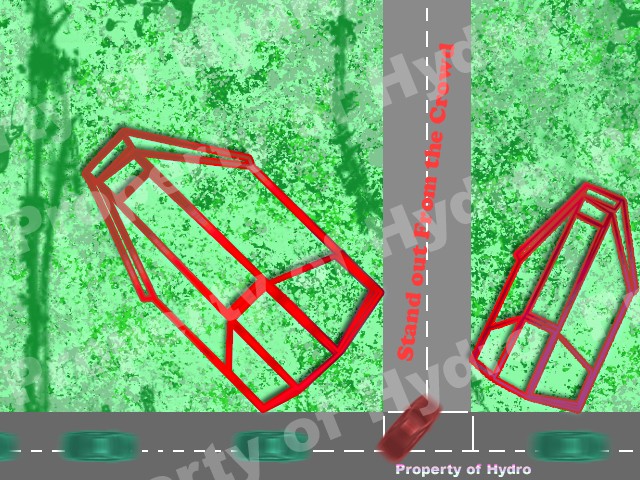
Alright, this is just a Beginning Stage in the design, but would like your guy's input.
I am designing a group of "themes" for a contest Nation(US)wide, called BPA(Business Professionals of America). I am brand new to it, and am entering for Graphic Design.
I have been presented a "theme" I guess you would call it
- BPA Theme wrote:
- Stand out from the Crowd.
The theme must include something to do with Chicago, IL, as well as the Quote above.
As Chicago is a fairly large city, I decided to make a theme layout somewhat based on Roads, buildings, and well...cars. Here is the image so far..
 https://i.servimg.com/u/f25/15/15/95/38/my-str10.jpg
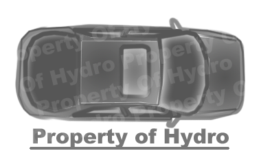
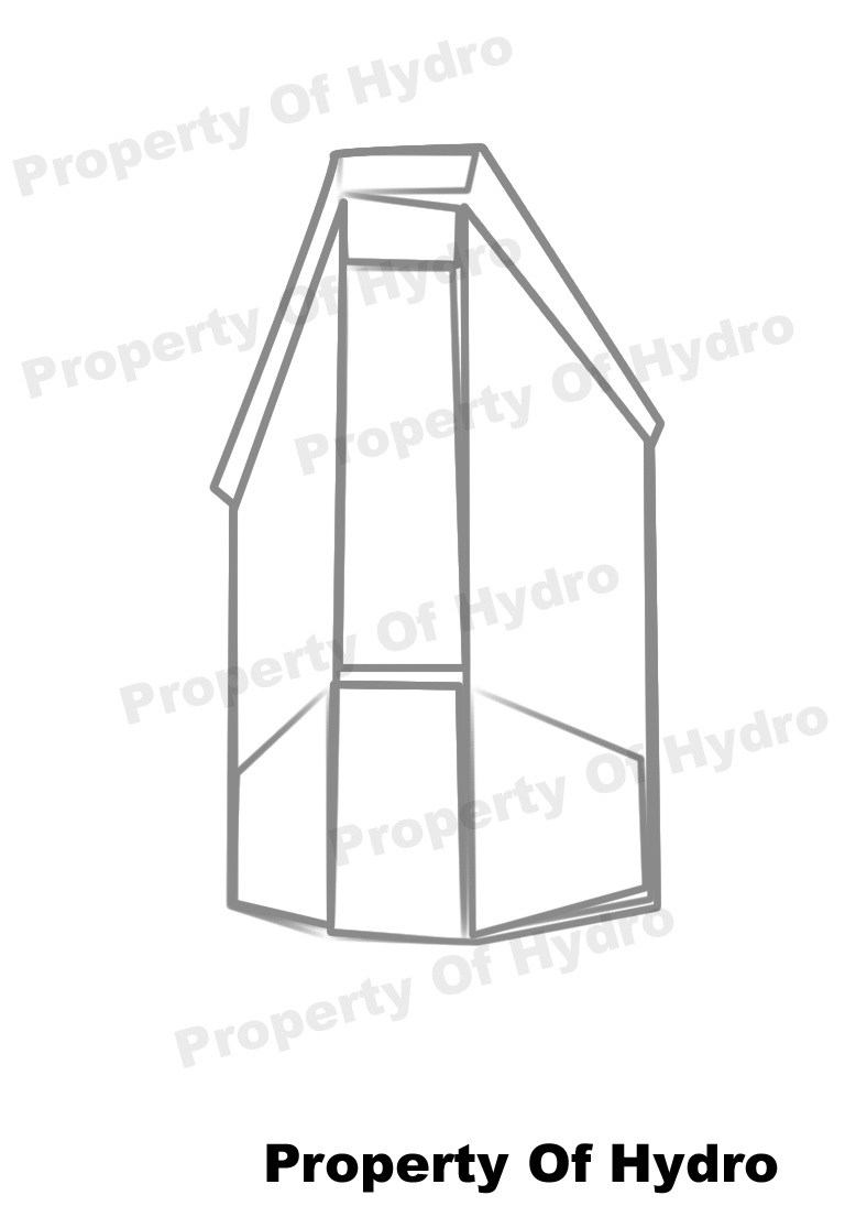
this image includes fully custom Car Designs shown in the following images, as well as Building Design in Full-Scale Size. The car was Designed off of a Dodge Charger found on the internet, and was revised, and "edited" if you would call it. the building was based off of another image I found on the web, and was a bit
lopsided I guess you would call it, but it actually turned out to look pretty nice. Yes, they don't look Hi-Tech or anything, but they will have to do for now. As I stated before, this is just a "rough draft" and is not a set Theme.
I would like your guy's Input on what I can do to edit, make look better, and well.. just some other Ideas for a theme quoted "Stand Out From The Crowd"
Other Images
My Designed Car:
https://i.servimg.com/u/f25/15/15/95/38/my-car10.png
My Designed House:
https://i.servimg.com/u/f25/15/15/95/38/my-hou10.png

